






Print guide
Pantone and spot colours
A spot colour is a single ink mixed to one exact shade, rather than built up from dots of cyan, magenta, yellow and black. Screen printing uses spot colours, each printed from its own screen. If your brand has Pantone references, send them and we'll match to them; if not, we match to your file.
6 min read · Updated 24 September 2026
Spot colour or CMYK?
There are two ways to get colour onto something.
Process colour (CMYK) builds every shade out of four inks, cyan, magenta, yellow and black, printed as tiny overlapping dots. From a distance your eye blends the dots into oranges, greens and skin tones. It's how magazines, leaflets and most full colour printing on paper works.
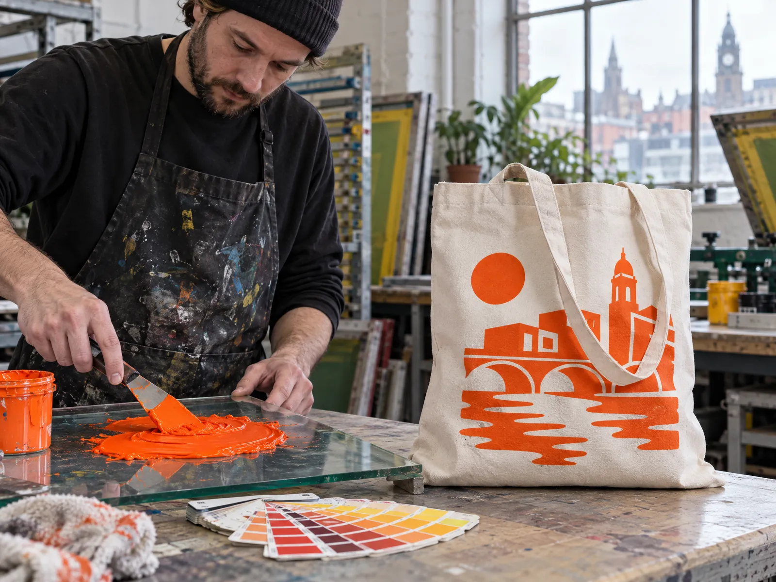
Spot colour skips the mixing on the page. Each colour in the design is mixed as its own ink before printing, to one exact shade, and printed as a solid area. A logo in navy and orange uses two spot colours: a navy ink and an orange ink.
Screen printing on bags uses spot colours. Each ink has its own screen, so the colours come out solid, bright and crisp, even on textured cotton and jute. It's also why the number of colours matters: "2 spot colour printing" simply means two inks, two screens and two passes through the press. We print 1 to 4 spot colours on one side or both.
What Pantone is
Pantone is a numbered library of colours used by designers and printers around the world. Each reference, such as a particular red or blue, has a recipe for mixing that shade of ink, so a printer anywhere can match it. If your brand guidelines list colours like "Pantone 286 C", those are Pantone references.
The letter at the end matters. C means the colour as it looks printed on coated, glossy paper, and U on uncoated paper. The same number can look noticeably different between the two, so send the reference exactly as your guidelines give it. Fashion and textile designers sometimes use Pantone's separate fabric references instead, which end in TCX or TPX. Any of these are fine: just tell us which you have.
You don't need Pantone references to order. Without them, we match the inks to the colours in your file. They are worth sending when your colours must be exact, or when you'll want bags to match other printed items and future reorders.
What to send us
| If you have | What we do | Good to know |
|---|---|---|
| Pantone references | Match each ink to the reference. | The most reliable way to match a brand colour, and to keep reorders consistent. |
| A vector file with colours set | Match the inks to the colours in your file. | Colours on screen vary between monitors, so if a colour must be exact, add a Pantone reference. |
| Hex or RGB values | Match to your file. | Hex and RGB are screen colours. Look for Pantone equivalents in your brand guidelines, or ask whoever designed your logo. |
| CMYK values | Match to your file. | CMYK is a recipe for paper printing, not an ink. It gets us close, and a Pantone reference gets us closer. |
| A PNG or JPG | Match as closely as the file allows. | Fine for a simple logo. A vector file is better if you have one. |
Whatever you send, we check it for free and email a proof before anything is printed. Free artwork check.
Why colours look different on fabric
A Pantone match on a bag is a close match, but it won't look identical to your screen or to a glossy brochure. That's worth knowing before you see your first bag.
- The fabric shows through. Screen printing ink lets a little of the bag's colour through. Natural cotton is a warm cream, so it warms colours slightly; pure white bags keep them cleanest.
- Texture changes the look. Ink on woven cotton, canvas or jute has a softer, more matt finish than ink on smooth paper.
- Screens glow. A monitor lights colours from behind, so bright blues, greens and pinks can look more vivid on screen than any ink can.
- Dark bags need help. Light and bright inks on dark fabric need a white underbase to stay true, which counts as an extra colour. See our guide to printing on dark bags.
If you're matching to printed items you already have, tell us when you order. And if you want to see the fabric first, you can order an unprinted sample of any bag from its page.
Counting your colours
Your price depends on the number of inks, so count carefully:
- Black counts, and so does white. Both are inks.
- The bag colour doesn't count. Anything left unprinted is free.
- Tints count. A lighter version of the same colour, such as a pale blue alongside a navy, is usually mixed as its own ink.
- An underbase counts. Light colours on a dark bag need a white layer underneath, which is one more screen.
- Each side is separate. Printing both sides needs screens for each side.
We print up to four spot colours on each side. If your logo has more colours than that, it can often be simplified without losing anything people would notice; our guide to designing for a tote has tips. See how much each colour adds below.
What each extra colour adds
Choose a quantity and a number of colours to see the live price per bag, and how much of it is the screen charge.
- Per bag
- £1.79
- Order total
- £447.50
2 colours means 2 screens: a one-off £80.00 to make, plus £0.50 a bag to print the first colour and £0.25 a bag for each extra one. The screen charge is the same whether you print 50 bags or 5,000, which is why bigger runs cost less per bag.
Live prices for the Recycled Cotton Tote Bag, one side, ex VAT.
Questions people ask
What does spot colour mean?
A spot colour is an ink mixed to one exact shade before printing and printed as a solid colour, rather than built from dots of cyan, magenta, yellow and black. In screen printing, each spot colour has its own screen.
Do I need Pantone references to order?
No. Without them, we match the inks to the colours in your file. Send Pantone references if the colours must be exact or need to match your other printed items.
Can you match my brand colour exactly?
We match each ink to your Pantone reference or your file. On fabric the result is a close match, but the colour of the bag and its texture mean it won't look identical to paper or a screen. Your proof shows the colours we plan to use.
What is the difference between Pantone C and U?
C shows how a Pantone colour looks on coated, glossy paper and U on uncoated paper. The same number can look quite different between the two, so send the reference exactly as your brand guidelines give it.
Do I need to convert Pantone to CMYK?
Not for screen printing. We match our inks to Pantone references directly, so just send the references you have.
Can you print metallic or fluorescent Pantone colours?
Ask us before you order. Tell us the references and the bag, and we'll tell you what we can do.
Send us your colours
Upload your logo with your Pantone references, or without them, and we'll check it for free and email a proof.